I thought I’d take a brief break from prattling on about architecture and urban design to instead discuss what I mean when I talk about architecture and urban design, and write some pieces introducing the concepts behind walkable urban development. For this first installment, I’m going to introduce one of the basic foundational principles of walkability: the location and orientation of buildings toward the public realm (which, in America, is mostly found in the form of our city streets). Before we get started, though, here’s a brief history lesson:
Once upon a time, before the heavy suburbanization of the United States following World War II, this wasn’t something that needed special attention. Rather, orienting buildings toward human beings was simply the default. Be it a house, a shop, an apartment building, an office, a place of worship, it was generally prioritized first toward the pedestrian.
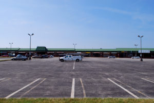
That all started to change after World War II. Zoning and land use regulations were altered to eliminate the mix of uses that made walkable neighborhoods thrive, instead forcing different uses into discreet, separate pods. Development started to spread to former farmland at the periphery of cities, and since public transportation was being gutted around the same time (and the widely spaced discreet development pods were difficult to serve with transit), it fell to the private automobile to provide transportation. Governments enacted minimum parking requirements, mandating every development to construct ever-larger parking lots or garages. Traffic engineers began over-designing streets for speed, making them excessively wide and free of “obstructions” like trees and pedestrian infrastructure. Further zoning changes required ever-larger front setbacks from these huge new roads, which became logical places to put all those huge parking lots.
That, in a condensed and abridged form, is how we got to the usual development style of suburbia: small single-use buildings situated behind rows of parking (or detached homes with huge garages on the front), physically separated from any other uses, with tiny or nonexistent sidewalks running alongside vast multi-lane high-speed roads. This form of development requires the use of a car to get around, leading to increased traffic, decreased health, and all the other issues I’ve spent years writing about.
So, what’s the alternative? It can be found in the way we designed and built structures, neighborhoods, and cities before rapid suburbanization.
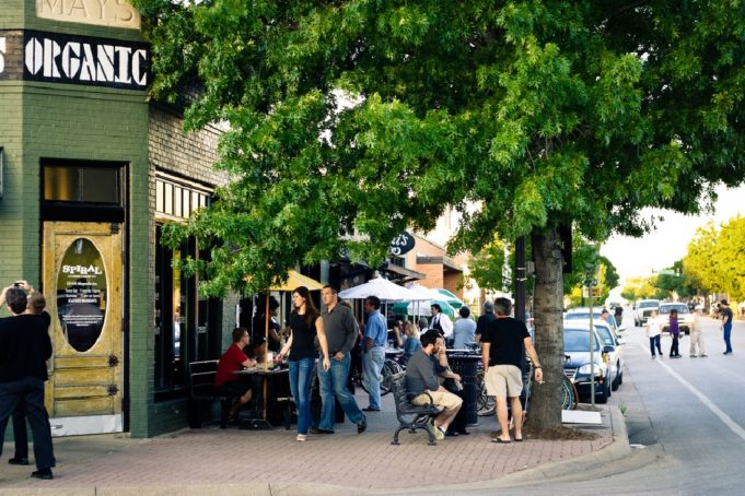
Let’s start with the buildings themselves. In walkable urbanism, buildings aren’t located behind large setbacks away from the street. Instead, they come right up to the street, nestled up against the sidewalk. This physical arrangement makes an incredibly important difference in making pedestrians feel safe and welcome. Rather than making people on foot feel neglected, unimportant, and bored as they pass barren asphalt and parked cars, buildings up on the street can engage and delight with entrances, windows, awnings, and other such people-oriented features.
Those features are another key part of urbanism. It’s not enough to just put your building on the street; rather, it has to do that and be interesting. On the average urban main street, this is done with ground-floor storefronts, plentiful windows and doors for pedestrians to enter, and interesting human-scaled architectural features. On grander civic and cultural buildings, this is done via bold architecture and important placement vs. the more normal buildings on the street.
The placement of buildings up at the street (along with their common form as mixed-use, multi-story structures) also contributes to creating a sense of enclosure along the street (which is helped if the street is narrow and small). This is important –– the most popular and successful urban places work by creating an “outdoor room,” with walls comprised of the buildings around them. This outdoor room creates a psychological feeling of comfort that makes people want to be there. There are examples of this in Fort Worth, from the wide sidewalks and enclosing buildings of places like Magnolia Avenue to the grand living space of Sundance Square Plaza –– all of these places, at their best, share this feeling of being in an outdoor room.
In future installments, I’ll talk about other aspects of urban design. It’s a topic that doesn’t get any real in-depth coverage in most local media, so I feel it’s important to give it the attention it deserves. This is, after all, about constructing the human environment.


I drove east on Lancaster today, and saw for the first time that the stretch between I-35 and Pine/IM Terrell is perfectly scaled for pedestrians. This also happens to be Shelter Row, so it has a bit of a reputation problem. It seem that urbanism in Fort Worth is limited to the elite of the Near South and the blight of the near east. We badly need middle class (real) urban neighborhoods.
The automobile gave rise to suburbanization and the demise of public transit, not the other way around. There’s much to be said for the urban village concept where it readily adapts, and Fort Worth has several fine examples: Race Street; downtown Handley; Magnolia Ave; the Stockyards. But these are pre-automobile neighborhoods. Trying to apply the same model to existing post-automobile neighborhoods is more daunting. A couple of years ago a Fort Worth city official came to my commercial area on East Lancaster to plug the village concept. The problem is that buildings here were constructed during the 1970’s when the car was king, and are not suited to the urban village concept. Be mindful, too, that many businesses–funeral homes, lawyer and doctor offices, body shops, etc.–don’t benefit from pedestrian traffic and are less suitable to the urban village concept.
Most who advocate this concept are environmentalists motivated by a desire–often unmentioned–to curtail automobile use, and I do not agree that neighborhoods designed for people who drive are any less human than neighborhoods designed for people who walk.