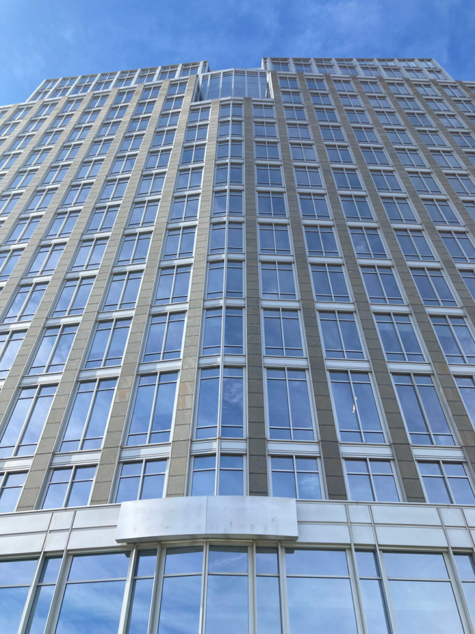
On the heels of a municipal election that brought in a slate of new faces to Fort Worth City Council, many of whom campaigned on a more open and responsive city government, one committed to addressing the inequities that divide west and east Fort Worth, the city, months before, thought moving into the former Pier 1 headquarters in 2022 was a good idea.
It’s somewhat ironic because accessible, equitable, and municipal, it is not.
When the architecture firm Duda|Paine of Durham, North Carolina, was commissioned to design the headquarters for the retailer in the early 2000s, it faced a difficult task. The property, for one, was in the Central Business District but as far as one could get from the bustle of downtown. Building a tower was without a doubt on executives’ minds. Towers enhance skylines, and a big skyline signals confidence, power, and strength. The goal was for everyone to see it. Yet the location is more in tune with the nearby Trinity River than with the street. The team had to at once deal with the hubris that comes with creating a corporate headquarters in an urban core as well as the fact that it was removed from the same core. And they had to do it for Pier 1, a go-to source for overpriced incense and wicker for suburbanites.
After surveying the area, Duda|Paine crafted a handsome 20-story steel and glass building that looks like a man’s torso, with a deeply sunken butterfly roof. Light illuminates from the top all the way down the sides It is similar to their Frost Bank Tower in Austin, but, instead of sharp roof edges, that one has a crown. It was designed as a corporate headquarters, expressing confidence. It was not designed to be a city hall.
Yet thanks to a fast one pulled by city council last December, it will be. That’s when, within days of announcing plans to purchase it, they swiftly and unanimously voted to buy it. There was no dissent, much less discussion about the rapid decision-making rate and lack of transparency that came with buying it. The mayor and council parroted the following lines: They had to move fast because the window to buy it was closing; it’s fiscally prudent and a better deal than building a new one for an estimated $250 million; it will consolidate offices currently spread out across downtown; it is better looking than Edward Durrell Stone’s City Hall, a frequent target of bullying by citizens and the city. The purchase additionally did not require voter approval because the $100 million price tag instead is financed using tax notes, which allow the city to immediately purchase it and to pay it off later. The purchase was also former Mayor Betsy Price’s last big contribution to the city before announcing her retirement.
The last time a city hall was built locally was in 1971. City leaders mounted a campaign parroting similar lines about the need to consolidate departments spread across the city, but the public was also actively involved. They were able to take a vote. What became the third people’s house was a modern stone and glass building centered around an atrium, the lower level of which was designed as a one-stop customer service center. It, too, was designed to induct a new era for Fort Worth as well. Designed by Stone, a famous New York architect, the flat modernist building gets its fair share of bullying by the public and elected officials alike who deem it inefficient.
It wasn’t always that way: Small features, including a fountain and pond (later replaced with a garden), welcomed citizens. Other changes decimated the municipal experience, including a nationwide epidemic in the 20th century that left urban cores to rot.
As with its predecessor, the idea of a new city hall was rooted in fiscal prudence and government efficiency. A new, tall city hall is also about showing Fort Worth as a major player on the global field. For Price, who served as mayor for a decade and saw the city rise in population amid rapid changes, this building aligns with the goal of creating that new city. A New Fort Worth is rightfully or wrongfully rooted in implementing the city’s modest economic development plan from 2017, which emphasizes diversifying the tax base by attracting emerging industries.
In his new book City Hall: Masterpieces of American Civic Architecture, photographer and writer Arthur Drooker documents 15 of the country’s most distinct city halls, from San Francisco to Buffalo. He believes city halls have the chance to empower the citizenry through bold design and accessibility. In the introduction, Thomas Mellins, an architectural historian, writes that the halls selected by Drooker were built to express civic pride and show the cities were at the forefront of change politically, economically, and architecturally. Not all the city halls deserve to win awards, he notes, but they were designed with the citizenry in mind.
That’s what makes the decision to acquire Pier 1 so disappointing. It may bring departments together, offer more parking for citizens, and have a nice view of downtown, but it’s a lost chance to create a city hall that serves as “a community’s living room,” as former San Jose Mayor Ron Gonzales said upon the opening of their Richard Meier-designed hall.
Even worse, we further cheapened the expectations of our government and betrayed the confidence of our younger, riled-up electorate.
A tower upon the hill it may be, but a shining example of a city upon a hill this is not.


