West 7th Street is simultaneously a place of progress, huge potential for future improvement, and some regrettable mistakes on the path toward becoming a real walkable neighborhood. The street itself is slightly tamer than it used to be, but it’s still defined by speeding cars and inadequate pedestrian facilities. Bike infrastructure is better, but not as safe and appealing as it could be. And while numerous new developments have been built along the street, not all of them interact with the public realm in successful ways.
Nowhere is this more obvious than at Montgomery Plaza, the first big development project that popped up along West 7th. The redevelopment of the historic Montgomery Ward building certainly brought new businesses to the area, but it also brought a truly backwards-thinking suburban design that is actively hostile toward the kind of human-focused street life the area needs.
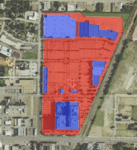
The site plan of Montgomery Plaza reveals the wasteful layout of the property. A huge swath of the development –– something on the order of 70 percent –– is consumed by surface parking. In the middle of the central city, in what should be a prime area of walkable urban design, building such massive patches of pavement is a waste. All that parking creates large amounts of dead space and leaves most of the property as an emptiness that no human being ever wants to cross on foot voluntarily. It’s especially baffling given that the upper floors of the old Montgomery Ward building are sold as condos, and the development has a grocery store in the form of a Super Target but they’re placed at opposite shores of a vast inland sea of parking, making the walk from your home to the grocery store into an unpleasant ordeal instead of the pleasant stroll through the neighborhood that it should be.
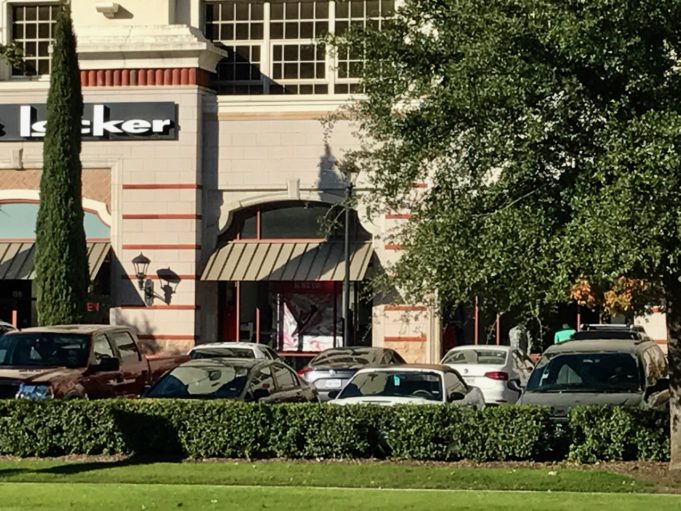
What’s more, even if you want to walk to a business in the development, past all that surface parking, the design of the property actively works against you. There’s no safe access from the sidewalk to the development – the entire interface between the two is blocked by shrubs. You must either press through the shrubbery or walk through one of the driveways, braving the traffic moving in and out. The old Montgomery Ward building is set back from the street, but rather than create a grand and meaningful public space to serve as a center point of the project, the space between the building and the street is simply more parking that dissuades pedestrians. Not that the newly constructed strip mall buildings fare better – the one built along Carroll Street turns a blank back wall to the sidewalk, with all businesses facing inward toward the parking lot, and the Super Target and other businesses at the back are walled off from all property further to the north, blocking any movement from that direction and forcing cars and pedestrians onto Carroll Street.
It’s a development that works against pedestrians while providing massive incentives for driving, which is exactly the kind of thinking we don’t need in shaping our central city. It strikes me as another example of the city’s long-running “any development is good development” attitude that sees inappropriate car-oriented projects happen in locations all around the central city, simply in the interest of “getting something going.” A more selective and less desperate attitude that recognizes that not all development is truly progress would serve walkable Fort Worth far better in the long term, but it’s hard to make that happen when the allure of shiny new projects is so powerful.


Wow. Really? Do you realize how long this shopping center has been there? You wrote this article as if it just sprung up.