Main Street in downtown is an interesting environment these days, from the perspective of analyzing the public realm. It’s somewhat enclosed, terminated at the north end by the Tarrant County Courthouse and at the south end by the Fort Worth Convention Center. Like an urban petri dish, it is a kind of microenvironment that can be studied from a variety of approaches.
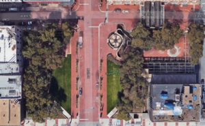
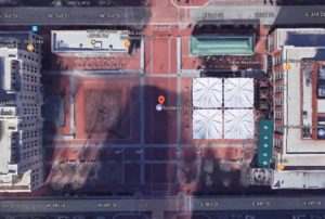
Within the boundaries of Main Street, there are now two large plaza spaces. The most obvious of the pair is Sundance Square Plaza, the multi-million-dollar spectacle that replaced the two dreary parking lots that held down the very heart of Sundance Square for many years. The other is far less famous and far less successful as a public space: General Worth Square, the forgettable patches of grass lining the street in front of the Convention Center.
It’s worth looking at Main Street’s two wildly different public spaces, because they showcase how an urban park or plaza can be something that enhances its surroundings, or something that provides little benefit day-to-day.
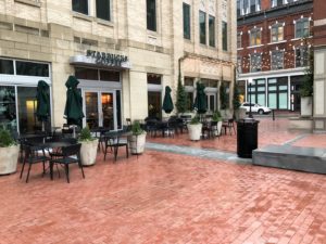
Something I’ve harped on here before is that within an urban setting, context is king. The more a building or space tries to be a solipsist, the harder it is to make it work within a city. The buildings around Sundance Square Plaza interact directly with it –– coffee shops, patio dining areas, and inviting windows open up directly to the plaza. These buildings provide engagement with the public space and give pedestrians more reasons to be in the plaza other than the act of simply looking around. From every angle and every approach, there is something to engage the eyes and the mind of pedestrians and make them want to be in the space and move around it. Within the plaza itself, there are active and engaging areas like the fountains and more serene, relaxing places like the seating under the four giant shade structures. The designers of Sundance Square Plaza recognized that a city square should not be solely concerned with the features and activities within its own borders. The edges of a public space in an urban setting are as important as the center.
This is not to say that every successful urban space must include the variety of activities that Sundance Square does. Even a simpler setting can be made inviting and attractive when it ties itself into its surroundings in healthful and engaging ways.
This is part of why General Worth Square is such a nothing of a public space. Carved out of two half-blocks of what used to be Hell’s Half Acre, General Worth has little in the way of real engagement with its surroundings. On the western side of Main Street, it greets the backsides and garbage dumpsters of buildings fronting Houston Street with a concrete wall beneath trees, creating a bleak environment. Nothing that ever happens in those buildings can tie into General Worth Square. The restaurants and bars can’t use it as part of an outdoor seating area. Physical access between the buildings and the square, at its most basic level, is blocked by the wall.
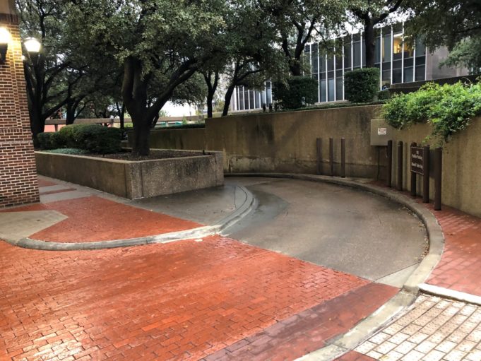
On the eastern side of Main Street, General Worth primarily interacts with a pair of parking garage ramps (showcasing how fortunate we are that Sundance Square didn’t put an underground garage beneath the plaza), the valet stand of a hotel, and a nondescript glass office building with no ground-floor engagement. At the corner of 8th and Commerce Streets, there’s a hard-surface plaza space with a modest fountain that’s walled-off from Commerce entirely. (In all honesty, I only remembered this part of General Worth Square existed upon reviewing the location on Google Maps, so completely forgettable is its presence in the fabric of downtown.)
The main features of General Worth Square are simply two half-blocks of grass on either side of Main Street. Simplicity is not a bad thing, but there’s nothing interesting or engaging about the central area of the square. Since the buildings around it either turn their backs to it or don’t engage with it in any meaningful way, General Worth Square sits very under-utilized most of the time.
The one part of the square that has consistent activity is its newest: a statue of President John F. Kennedy that commemorates his visit to Fort Worth and staying at the nearby Hotel Texas (now Hilton Fort Worth) the day before his assassination. The statue and its small plaza and wall are the only really engaging parts of General Worth Square in its present configuration.
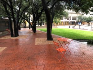
General Worth Square is the kind of barren 1970s “urban design” that so often resulted in a degradation of true urban life, and which (like so much urban design of the period) missed the point of why cities work in the first place. One hopes that as the southern and eastern sides of downtown develop and re-densify over the coming years, the city will take a fresh look at General Worth Square. It would be worthwhile to consider redesigning it, making it more of an asset and less of a generic, unremarkable “open space,” particularly as there is already a large apartment tower and another hotel in the planning phases nearby. One day, perhaps, Main Street can have a genuinely successful public space at each end.


