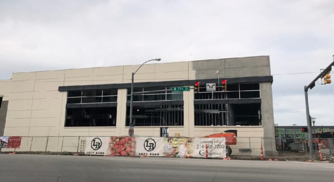
If you’ve spent any time at all along 7th Street lately, you’ve no doubt noticed that a Tom Thumb is being built across from Trinity Park and the So7 development in what is being called “Left Bank,” at 7th and Stayton Streets. Now, I’m not about to argue that having another grocery store in the central city is a bad thing, but now that the Tom Thumb’s building has started coming together, I am going to suggest that we aren’t doing this stuff well enough, because this building has certain flaws that make it a poor fit for an increasingly walkable area.
If I may direct your attention to the photo of this new “urban” Tom Thumb, please note that what we’re looking at here is the building’s frontage along 7th Street. You know – the most important, primary street of this district. And, while the building does sport slightly more architectural effort than most modern grocery stores, the view along 7th showcases how this “urban” development is no such thing – it’s merely paying the absolute minimum amount of lip service to the concept of a walkable urban place.
Think about the elements of a building’s design that make it appealing to pedestrians: plentiful windows, a human scale, and entrances on the street –– items that are the basic minimum of things a building needs to make pedestrians feel welcome. Now notice how this new Tom Thumb features precisely zero of these elements. The building does have more windows than typical grocery stores (which tend to be completely windowless apart from their entrances), but look at the way they’re situated on the building’s facade. They’re far above the heads of even the tallest potential pedestrians, who will be more in the scale of that chain-link fence around the construction site. If you walk down 7th past this grocery store, you won’t be enticed by glimpses of produce or human activity – you’re going to be passing an utterly blank wall with all the charm of a freeway barrier, with windows taunting you from fifteen feet above. It’s less “engaging urban storefront” than “hulking, barren monolith.”
The building also fails to take advantage of its location with a prominent entrance. Being situated at the corner of 7th and Stayton Streets, one might think the store would want a big, welcoming, notable entrance on the corner – a big statement along a busy street, calling for you to enter. This is not the case – in fact, if one looks at the building from a little more to the east than the spot I took this photo, it’s obvious that the building’s entrance is solely accessible from the side that will face the parking lot. This is a building in a large urban development along one of the city’s biggest streets, and it completely turns its back to the street to focus solely on car-based customers. It can’t even manage to put windows at human level.
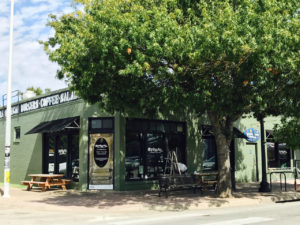
Contrast this with virtually any building built during eras in which we as a society knew what we were doing. I’ve included a photo of Spiral Diner’s building, but it’s just an example (it’s easy, because the Near Southside is filled with structures of this quality). The scale is different, but that’s not what’s important – buildings both large and small can be made approachable and engaging to pedestrians. Notice how the entrance is right on the street, and the storefronts are at human level, and people aren’t made to walk past huge blank concrete walls.
It’s my understanding that the developer of this new grocery store got a variance from the Board of Adjustment, allowing the developer to get around some of the provisions of Fort Worth’s mixed-use zoning to building what is essentially a gussied-up suburban big box store. Not only does it reflect how development done with a lack of vision will undercut the experience of these redeveloping walkable districts, so too does it illustrate how Fort Worth’s city government is still far too consumed with an “all development is good development” attitude, making it easy to slip counter-productive designs onto our streets and neighborhoods. One can argue that most people will be going to this store by car. While that may indeed be true in the immediate future, 7th Street is only going to be getting denser and more full of people who want to walk to satisfy their daily needs – and allowing designs like this to get built does nothing to make their experience a positive one. The pedestrian must be the core building block of a healthy city, not something to be thought of as second-class.


