In architecture and urban design, as in many things, it’s important to get the details right. A lot of things in these fields can be thought of in terms of an assemblage of details. Where do the windows go? How big are they? How does the building interact with its neighbors? Where does this bike lane connect to a cross street, and how is that connection handled?
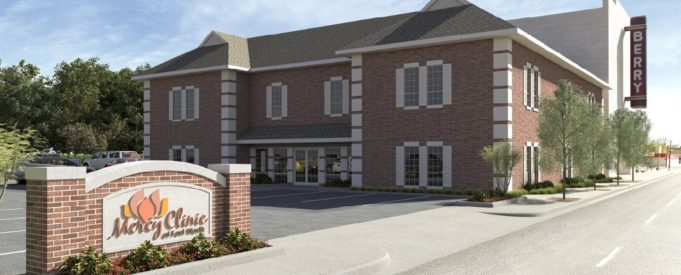
Often, a detail that might be dismissed as small can have a real impact on how a building comes across to the city. I was thinking of this after I saw a rendering for a new building posted next to the long-vacant Berry Theater on Hemphill Street.
This new, not-yet-constructed building is a new clinic for the nearby Travis Avenue Baptist Church. If you’re just looking at the structure as an object floating in a void, there’s not much to dislike. It’s modestly attractive, humanly scaled, and would fit in on many walkable urban streets just fine. Taken as a standalone item, about all there would be to say about it is a timeframe for its construction.
Buildings can’t be taken solely as objects, though. They have to live in the real world. And it’s here that this perfectly fine building is let down by a detail: It’s turned sideways.
In a walkable urban setting, one of the foundational concepts behind making places people want to be is that the buildings along the street must interact with the street in friendly ways. One of the ways that is accomplished is by putting architectural interest and, importantly, entrances and exits on the sidewalk, rather than solely facing the parking lot. Even if a person walking by never enters the building in question, the presence of street-facing entrances will psychologically make them feel welcome in the space around the building. The same goes for pieces of architectural detail that make a building more interesting.
With this new clinic building, the entrance and all the biggest architectural details –– the varied bays, the gables of the roof –– face away from Hemphill Street and turn toward the parking lot. All that faces Hemphill is a plain brick wall with a handful of small windows and a standard-issue roof.
Taken as one building, this might not seem so bad. But if enough buildings are designed this way, it has a noticeable deadening impact on the street. What’s more, the Berry Urban Village hasn’t even taken off –– it already has a variety of vacant buildings and inappropriate car-oriented structures like strip malls and the Wal-Mart market. Adding yet another building that turns away from the street doesn’t do anything to make Berry Urban Village into a vibrant, engaging place.
It’s especially unfortunate in this case, because the building itself is perfectly fine and, if turned to face the street, would make a very pleasant addition to the street. The only sizable flaw with it is its orientation away from Hemphill.
One would think that the development guidelines and zoning in a designated urban village area would dictate that buildings have to be oriented toward the pedestrian realm –– the foundation of all great city neighborhoods –– but that appears to not be the case.
My goal here is not to single out and throw shade on Travis Avenue Baptist at all (this is hardly the only example –– I’ve noticed a couple of Near Southside businesses similarly close their street-facing entrances in favor of making everybody go through the parking lots in the back). It’s more to point out how even otherwise good buildings can go wrong and ask that our developers and City Hall hold our central-city urban villages to higher standards if they’re going to be truly successful in the long term. Places like urban villages have to be thought of as a whole, not just a collection of individual developments.


You make a good point that having the architecturally interesting parts of buildings face the street make neighborhoods feel more welcoming and interesting. However, wouldn’t it be more difficult for patients, especially ones with limited mobility, to go around to the front of the building to enter the clinic? How do you think it would look to give the street facing side more architectural interest while still having a side entrance? What would be a good solution to having the building interact with the street better while still being convenient for patients?
Have a functional side entrance that doesn’t necessarily have to be the main entrance – much the same way many home owners use their side or back entrances, but still have a street-facing front door.