“What you see”
Timothy Harding at Cris Worley Fine Arts, Dallas
A lot of painters eventually move away from the canvas and into sculptural installations. I think it’s because when painting moved away from representation to abstraction, that space eventually became too small for the ideas that they wanted to express. The result is either entrenchment in those older modes or a straight up leap off the canvas. I think that migration away from flat surface paintings responds to many siren calls, but none stronger than the 3-d plane. When it is successful, it results in a more critical and engrossing experience with art.
I’m thinking about Timothy Harding’s Skin, a show of the artist’s paintings on view at the Cris Worley Gallery in Dallas. There is a history of other painters who have leaned their easels towards sculpture, like Picasso, Barnett Newman, and Frank Stella, whose current retrospective at the Modern art Museum Fort Worth made me think about this.
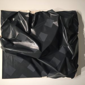
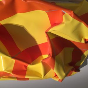
Skin is a series of nine acrylic-on-canvas grid paintings that are wrinkled surfaces protruding into sculptural 3-d shapes. Harding achieves these mangled and contorted forms in two ways. He either attaches painted strips of canvas to his surfaces and builds them up to create volume or wrinkles them, creating surface relief. The viscosity of the wrinkled surfaces, coupled with the gloss of the acrylic paint, suggests something entirely different from the minimalism the works aspire to. It feels more pop art than minimalism. It’s as if the paintings were blown up pixels of a Roy Lichtenstein work.
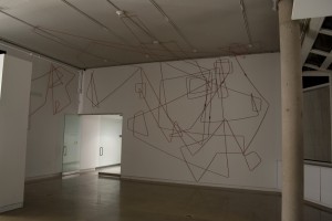
Harding’s fascination with the grid goes back to at least 2009, when his drawing materials vacillated between the traditional graphite to everyday materials like extension chords and florescent light bulbs. These sometimes room-sized installations bore hints of minimalism, an art movement less concerned with adornment and more with materials and presence. And, although there are nods to artists like Dan Flavin and Agnes Martin in Harding’s early 2009 drawings, his handling of these materials pushed his work farther away from them and became their own thing. It is from this fearless experimentation that the Skin paintings emerged.
One of the pieces, titled 61” X 52” on 52” X 40”, is a gray scale grid painting. The shadows on the surface are rich, and exaggerate the wrinkles into line drawings that all but obliterate the surface grid. There is also a hint of un-primed canvas thrust onto the viewing plane of the painting from the right side, creating a visual relief to its dark and heavy focus.
Another painting, 64” X 52” on 48” X 36”, is a vibrant yellow hue, broken into contorted squares by the thick orange stripes which crisscross the picture plane. It harkens back to the early 2009 power chord drawings and suggests an artist’s internal dialogue with his work.
I’d like to take a leap of my own and suggest a viewing of Harding’s work in the context of the Frank Stella retrospective. It’s quite a leap to be sure, but here’s what I’m thinking:
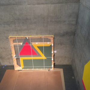
Formally speaking, there are a few connections, like bold colors, lines that sometimes turn squares into grids, and moving between sculpture and painting in such a way as to blur or flat out obliterate those distinctions. But beyond that, both artists have a knack for boundlessness, that make their ideas feel so fresh, no matter how many times you return to their work. For Harding, even his shipping crates become a way of thinking about his work.
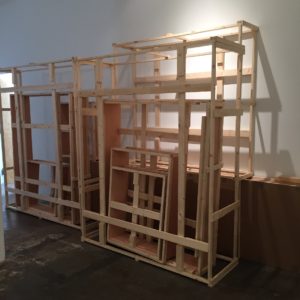
You can see Skin at the Cris Worley Gallery through May 7.
Critic’s note: I have collaborated with Timothy Harding both as an artist and as a curator, showing his work and exhibiting work together.


