The new exhibit at the Amon Carter Museum of American Art contains all of its color in a black box. The entrance and exit to the galleries are darkened, resembling a camera obscura or dark chamber. These contraptions were used decades ago to bring the outside world in, through a tiny hole placed in one wall of a pitch black room. The draughtsman or painter would then enter and trace the scene that the light exposed onto one of the other walls.
The invention of the camera was a way of making permanent these fleeting moments, and Color! American Photography Transformed comes close to producing an understanding of the immense influence that color photography has had over the past century.
Organized by the Carter, the exhibit makes three statements about how color can be used: as pure subject matter, a workaday contrast to black and white, and a conduit to realism.
Although the works articulating these ideas are interspersed throughout the galleries, photography curator John Rohrbach makes an undeniable pronouncement at the exhibition’s entrance with Cory Archangel’s “Photoshop,” a horizontal pool of aquamarine and blue that nullifies all sense of depth, completely immersing the viewer. Unlike, say, Olafur Eliasson, an artist who uses colored lights in controlled spaces, this photo achieves a similar resonance and sensation of engulfment via only two dimensions. Photography, Rohrbach is saying, can be just as powerful as painting.
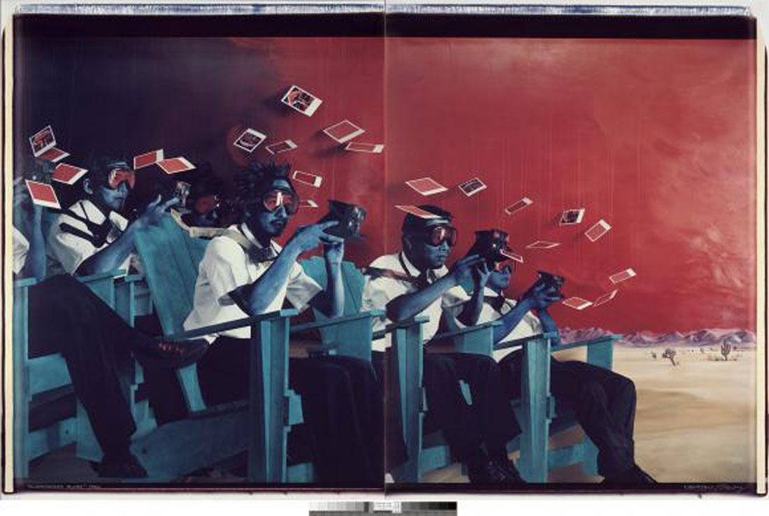
There are a few other notable examples of this kind of photographic effort, and two of them hang side by side. “Alamogordo Blues,” a print from the duo of Patrick Nagatani and Andree Tracey, and Sandy Skoglund’s “Revenge of the Goldfish” both represent a kind of still- life motif, where fantasy and color are combined in ways similar to Old World paintings.
One of the clearest manifestations of photography’s artistic strength is also the tiniest. In the 3.5 inch-by-4.5 inch “Photo-Transformation, November 22, 1973,” photographer/painter Lucas Samaras employs a technique that he mastered and popularized: creating painterly effects on the surface of a still-developing Polaroid print by pushing around the chemicals under the plastic surface with a blunt edge. The result this time is a ghostly red hand pulsating with yellow, surrounded by visual static. Samaras’ brush-like approach serves as a literal connection between photography and painting –– and is a nice way to start a conversation about color versus black and white.
Fights about authenticity in photography have been raging seemingly forever, and by offering meticulously hand-painted daguerreotypes and tintypes (the first kinds of photographs), Color! references the debates. Instead of dismissing the manipulated imagery of Pictorialism as too painterly or declaring it avant garde, we argue over film versus digital and plastic camera effects versus Instagram filters. And onward the discussions roar.
Along with staged portraits by Cindy Sherman and Laurie Simmons, color as realism is best represented by Nan Goldin’s “The Hug, NYC” and Andre Serrano’s “Madonna and Child II,” both from 1989. Depicting a statuette of Mother Mary and baby Jesus submerged in a yellow liquid, ostensibly urine, Serrano’s piece says more about our reactions to color –– it could be orange juice for all we know –– than our feelings about religion. On the other hand, Goldin’s intimate candid of two lovers greeting each other in a bedroom serves up a kind of realness that is less monumental than, say, Ansel Adams’ “Moonrise and Half Dome” but just as commanding: By this one photograph, we feel as if we know these people.
Another much more somber and arresting application of realistic color occurs just beyond the exhibit’s lone Sherman print. Carrie Mae Weems’ “Blue Black Boy” and Tina Barney’s “Beverly, Jill and Polly” hang next to each other and portray two Americas. Weems’ monochromatic triptych focuses on the hierarchy of skin tones among African-Americans, a sad reality rendered even more irrelevant when the image is viewed next to Barney’s, in which two young white girls are seemingly oblivious to the black maid cleaning up after them. In a 2011 interview in Photo District News, Barney revealed what is obvious in her piece: the vibrant hues of privilege.
Though some Color! selections are weak, there’s always Richard Misrach’s “Paradise Valley,” a large-scale study of the namesake location that shows all the warm colors of a desert sunrise. The obvious formal nod to Mark Rothko can be made and maybe argued as a vindication of photography as art. To quote photographer Paul Strand, “I think it is very important for young photographers to find out about the whole development of the graphic arts, not simply come along and show photographs that could not stand up to a Cezanne for a second. You cannot claim that photography is an art until your work can hang on the same wall.”
The success of any image still hinges on its ability to engage. And with the power of color as both subject and tool, Color! does just that.
[box_info]
Color! American Photography Transformed
Thru Jan 5, 2014, at Amon Carter Museum of American Art, 3501 Camp Bowie Blvd, FW. Free. 817-738-1933.
[/box_info]


