There are a lot of Andy Warhols. The Campbell’s-soup-can-reproducing Andy. The tedious filmmaking Andy. The celebrity Andy. But there’s also an Andy that few casual art lovers know: the unboundedly creative and prolific Andy of the 1980s.
The period just before his death (from a gallbladder infection in 1987) is arguably his most idiosyncratic, most serious, and least patently gratuitous of his career and is the subject of Andy Warhol: The Last Decade, on view at the Modern Art Museum of Fort Worth through May 16.
 Organized by the Milwaukee Art Museum, The Last Decade gathers nearly 50 of his pieces and collaborations created during the decade of decadence. Most of them are garish and superficial but in that distinctly endearing, genuinely Warholian way. No visual artist ever thought to balance neon pinks and blues with pitch blacks as studiously and elegantly as Warhol. What really distinguishes the show, however, is the unrelenting intensity with which Warhol clearly approached his myriad subjects (print advertisements, iconic imagery, even Abstract Expressionism itself) and forms (painting, video, photography). The energy suffuses the cream-colored gallery walls and blond-hued hardwood floors upon which The Last Decade is set, lending the exhibit an undeniably personal, unrelentingly unique charm.
The ’80s marked a return of sorts to the basics. Warhol was always fascinated with and maybe a little repulsed by graphic design. The interplay of blocky typeface and powerful colors. The mystery by which a visual idea in someone’s head could be reproduced without derivation and seemingly ad infinitum on soup cans, cardboard boxes for canned fruit, and massive marquees. The unapologetic enthusiasm of corporations to sell! sell! sell! things. The sheer square, assembly-line American-ness of it all. The realization that art was a commodity like any other consumer good informed every piece of visual art produced by Warhol throughout the ’60s and early ’70s. The artist retained his ironic disposition toward consumerism in the ’80s. But instead of churning out cheeky faux-corporate imagery en masse, he did something he hadn’t done in a while. He picked up a paintbrush.
In the late ’70s and early ’80s, Warhol became inspired by Neo-Expressionist painters such as Keith Haring, Julian Schnabel, and two frequent collaborators: Jean-Michel Basquiat and Francesco Clemente. He was inspired by their work but also, Andy being Andy, by the popularity they were achieving. He still screened images mechanically but also began hand-painting them, blurring the line between machine- and man-made. He often clipped ads from newspapers or magazines, projected and traced them onto paper, and had acetates produced that were then screen-printed. He also hand-painted ads onto paper and then had silkscreens made of the paintings, which allowed brushstrokes and even bristles to appear in the finished prints. The works that resulted are distinct and pure Andy. Cheap and easy? Yes. But they clearly are the byproducts of an obsessive madman’s Americanized muse and worthy of admiration –– from a clinical perspective. A newspaper ad is still a newspaper no matter how large or small it is. But Warhol had his “day job” producing celebrity portraits. You could argue that he was not trying to sell any of his blown-up ads, just to explore multiple media and pursue his fascination with commercialism, which has to put a smile on your face.
The high points of The Last Decade are Warhol’s collaborations with Basquiat and Clemente. “Sin More (Pecca di piu)” by Warhol and Basquiat is a massive rectangular canvas about the size of an elementary school chalkboard, which is appropriate –– on one side are rudimentary line drawings of manila envelopes falling out of the frame; on the other, a rudimentary line drawing of a glass painted white and emblazoned with the word “MILK.” In the middle of the painting are the words “sin more.” Undoubtedly and as indicated by ghostly fragments of text hanging on, the words were part of a larger text design, one that read “And sin no more.” Oh, that Andy!
“Origin of Cotton,” by Warhol, Basquiat, and Clemente, is a riot of swirling reds, pinks, and blues and gaping faces beneath assorted scrawls in white. One is of a horizontally placed tube with an eye at one end between the words “BIG” and “EEL.” Another is a box containing the phrase “200 VOLTS.” Ridiculous, true, but there’s no doubting the spirited strokes on display.
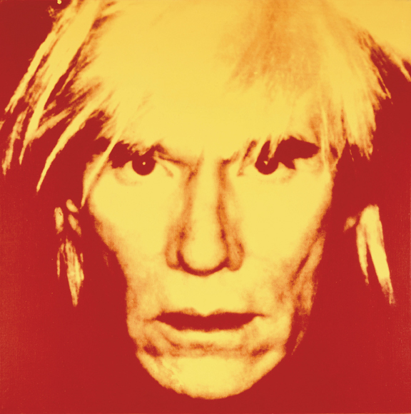
In addition to Warhol’s yarn paintings, “fright-wig” self-portraits, and camouflage paintings, The Last Decade includes his assorted commercial TV productions (running on a loop on a Sony color TV on a pedestal in one gallery) and also a series based on Michelangelo’s Last Supper that is regarded as Warhol’s most ambitious. In the series, the unforgettable image of Jesus and his apostles is for Warhol both a talisman and point of departure into other works: “Detail of The Last Supper (Christ 112 Times)” is an acrylic with silkscreen ink on canvas made up of, well, 112 smallish panels of Jesus’ face in yellow on black from the painting stacked together to form a rectangular canvas about the size of a Fleetwood. There are many others. In all, Warhol composed more than a hundred variations on The Last Supper theme, not bad output for a closet Catholic –– and closet capitalist.
Andy Warhol: The Last Decade
Thru May 16 at the Modern Art Museum of Fort Worth, 3200 Darnell St, FW.
817-738-9215.


