 In Miami, Arquitectronica masks the exterior of the environmentally certified Ballet Valet Parking Garage in vegetation. At Autostadt, Volkswagen’s automotive theme park in Wolfsburg, Germany, two 160-foot cylindrical towers house 400 cars on 20 levels and are serviced by a centrally located elevator that can retrieve a parked vehicle in less than a minute.
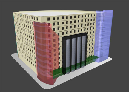
There’s at least one designer garage in every major city – and now Fort Worth. By the end of 2008, Christopher Janney’s 11-story parking facility for the Fort Worth Convention Center will be up and running, and it’s as close to perfect as possible. Long vertical scrims of transparent, illuminated glass cover each corner of the cubiform building that also will include ground-level retail and a “sound environment,” according to the architect.
Certain sounds will correspond to the building’s four compass points. The average dimwit (self included) might be able to locate his or her chariot simply by following Ornette Coleman’s loud, agitated baritone sax or the Tarantula’s pumping engine or some other distinct Fort Worth sound. (“Mooooo,” maybe?) Janney is currently taking requests, along with Fort Worth Public Art, the city program responsible for the garage, among other public-art projects. (From 1 to 3 p.m. on Sunday, April 20, at Circle Theatre downtown, FWPA will host “Urban Impact: Public Art in Downtown Fort Worth,” a symposium with Janney and Cliff Garten of Cliff Garten Studios, who has designed Avenue of Light, six towering stainless-steel sculptures on Lancaster Avenue that are part of an intense localized revitalization effort.)
Could the convention center’s parking facility be greener? Yes. Could its design be more adventurous? Absolutely. But perfection isn’t the point. As in chess, sometimes solving one problem in architecture creates another or more. Considering all of the variables, Janney’s building performs valiantly. It is an honestly wrought solution to the area’s parking problem and a commendable addition to the list of buildings that take parking design in a new direction. As in most spacious, growing cities, most people here drive rather than take public transportation, which makes parking a headache, for both the city and drivers. Think of all the gas we waste tooling around looking for empty spots, to say nothing of the time some of us spend wandering around on foot, trying to remember where we parked (sometimes even muttering, perhaps sarcastically, “Dude, where’s my car?”). And for cities, more rubber on the road means more strain on their infrastructures.
Let’s be realistic and admit that public transportation will never become commonplace in Fort Worth in our lifetimes. We’re Texans, and we like to go where we want, when we want. We need parking, and, honestly, we couldn’t have asked for better than Janney’s building. Especially compared to the rest of downtown’s relatively new buildings – mainly the monstrosities piled up by David M. Schwarz – Janney’s garage is a classy queen among drudges, mostly for the tasteful way in which the design incorporates the neighborhood’s prevalent Art-Deco feel without succumbing to outright mimicry.
Fort Worth is in an enviable position, at the cusp of significant growth in public art. A booming population is mostly why. In 2001, the city agreed to set aside 2 percent of all capital construction costs for public art, and if you’ve happened to notice the number of cranes hovering over town, there is a lot of construction going on. Around the same time, the city created the FWPA and the Fort Worth Art Commission, an advisory board. In 2002, the city selected the Arts Council of Fort Worth and Tarrant County as FWPA’s managers. FWPA’s first project was completed in 2005, with the installation of Fort Worth artist Vernon Fisher’s “Early Texas / Modern Texas” painting and Donald Lipski’s kinetic sculpture “Intimate Apparel & Pearl Earrings,” both inside the convention center. FWPA’s most recent completed project, Eric McGehearty’s “United We Stand,” is the bronze memorial sculpture of firemen’s boots in front of Fire Station No. 8 on the East Side.
Fort Worthians now have an unprecedented ability to shape the way their city looks and feels. The thinking is that if a city looks interesting, people will enjoy living there – more people means more tax revenue, which means more amenities for the locals and possibly a greater sense of civic pride. Though guided by FWPA, Janney’s building is not public art per se. The mission of providing visitors a place to park overrides the design elements. Public art, or art in public view, is largely nonfunctional and, as we know, often contentious. After he was erected in Burk Burnett Plaza downtown about five years ago, “Man With Briefcase” seemed to be the only thing people talked about. A lot of folks thought he was just plain dumb. “Where’s his cowboy hat?!” they yelled (and then angrily spat on the ground). Others thought the 50-foot brushed aluminum sculpture was a little on the boring side. “‘Man With Briefcase,’ huh?” they said. “Looks like some other city got the ‘Man’ – and we got the mold.” And some yokels actually were pleased; maybe not necessarily with sculptor Joseph Borofsky’s handiwork itself but with what it represented. “What better way to bring Fort Worth out of the 1800s and into the present day,” they crowed, “than by erecting a piece of irascible modern art right in the heart o’ town!”
Do any of us still harbor vehement feelings about “Man With Briefcase”? Has he, like a tree or construction site, become just part of the local scenery? Or do some of us simply – and quietly – adore him? Do men admire his large attaché, rakish fedora, and invisibility? Do women swoon to his implied solidity? Do pilgrims travel from the wilds of Arlington Heights or Samson Park to tend him oblations? Or leave dirty fast-food wrappers? Whether or not “Man With Briefcase” is still hot conversation fodder is moot. He does what most public art is supposed to: Get people thinking about their surroundings and also in new ways. Will Janney’s building? Probably not, but it’s not necessarily supposed to. -Anthony Mariani


