The Kimbell Art Museum building, designed by legendary architect Louis I. Kahn and opened in 1972, is one of the finest examples of Modern architecture in the world. Quietly confident and commanding, the Kahn building, as it’s come to be known, somehow manages to dominate its verdant surroundings while also melting into them, a Buddha meditating in the forest.
Even Buddha embraced imperfection, however, and the Kahn building had its share. For years, visitors have had to enter through the back door — the intended entrance was too far from the parking lot — and Kimbell curators long ago ran out of storage space. A 1989 plan to build onto the Kahn had been violently shot down by critics. Several years ago, the museum’s board of directors once again brought up the idea of an expansion that would allow the curators to display nearly all of their holdings, not just a fraction of them.
Some people, especially some architecture-minded folks, still expressed dismay, arguing that the Kahn building is simply too important, too beautiful to have its presence further obscured, even if ever so slightly –– already, within walking distance are Philip Johnson’s Amon Carter Museum of American Art (1961) and Tadao Ando’s Modern Art Museum of Fort Worth (2002), each rightfully claiming some portion of the Cultural District landscape.
But the board was determined this time, and in 2006 with the blessing of Sue Ann Kahn (Louis Kahn’s daughter) and Kay Fortson (president of the Kimbell Art Foundation), the directors began looking for an architect. The plan? Not an expansion but a separate building, in keeping with Kahn’s wishes. (When asked about future expansion years ago, he said it should “occur as a new building and be situated away from the present structure, across the lawn.”)
The directors wanted the new building to respect the Kahn –– but not grovel before it. After a short search, the board decided on Renzo Piano. Active since the 1960s, the 76-year-old Italian may be best known for The Shard, Europe’s tallest building, and, closer to home, the Nasher Sculpture Center in Dallas (2003) and The Menil Collection in Houston (1987), just two of 25 museums that he’s designed in the United States and abroad.
“He is the best architect of small-scale museums,” said Kimbell director Eric Lee.
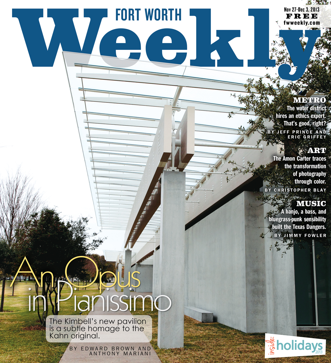
Another selling point was the fact that Piano studied under Kahn in the 1960s, making him uniquely qualified for the project. The major knock against the Italian master –– that his buildings are a little too quiet, a little too traditionalist –– actually worked to his advantage here, considering that the project’s focal point would be the grandeur of the Kahn building itself. Not surprisingly, the pavilion is understated — clean right angles, symmetry, and lots of concrete, wood, and glass — and it’s located on the Kimbell’s formerly spacious lawn, as Kahn himself had envisioned. The $135 million Piano Pavilion, which celebrates its grand opening this week, has changed the view of the Kimbell property forever –– and in the best ways.
********
For Piano, getting the right distance between the Kahn building and his pavilion was a major undertaking. He measured the site more than 50 times before finally settling on a distance of 65 yards to the west.
“You have to get the right distance,” Piano said. “Too close, and it feels like you are arguing. Too far, and it feels cold.”
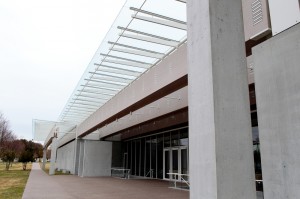
The relationship is definitely warm. The 120,000-square-foot Kahn building is a soft yet masculine symphony, a low-lying series of parallel vaults boxed into a rectangular shape with an undulating roof that magically looks different from every exterior perspective. The pavilion, at 101,130 square feet, is like the Kahn’s young daughter: bright, effervescent, and prim. Lying nearly as low as the Kahn, the pavilion is colonnaded with overhanging eaves and a glass facade, looking like the front line of a battery of infantrymen in white by day and by night a golden horizontal lantern.
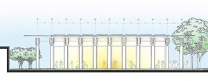
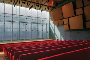
The pavilion is divided into two equally sized sections connected by a glass passageway that offers views of the Kahn and surrounding streets. The gracious, welcoming entrance, on the east, leads to galleries to the north and south. The western section, which is underground to conserve energy, includes a gallery for light-sensitive artworks, three education studios, a library, and, perhaps most significantly, a concert hall, whose stage is dramatically illuminated by a well of natural light. The combination of organic and man-made materials reflects the larger interaction between the new building and surrounding landscape. No individual aspect of the pavilion overpowers the other. The resulting effect maintains the visitor’s focus on the art.
“I generally am not a great admirer of some of Renzo Piano’s endeavors,” said Douglas Klahr, professor of architecture at the University of Texas at Arlington. “While he can often be a master in refining the details of construction, at times his buildings are self-effacing to the point of not being memorable.
“All in all, though,” he continued, “the [pavilion] has a dignified presence.”
The remaining lawn has been restored and lined with elms and red oaks.
Inside, custom concrete walls will give paintings a soft metallic-gray backdrop. The quality and strength of the specially mixed concrete allowed it to be built with very few tie holes, producing an almost perfectly flush surface.
“The concrete is a wholly different backdrop to the works of art” from the Kahn galleries, said Kimbell deputy director George Shackelford. “It is particularly beautiful behind works that are made from earth, stone, or wood.”
Piano described the concrete as a kind of homage to Kahn.
Kimbell curators, Shackelford said, are now free of past balancing acts. “The Kimbell has needed to expand for many years,” Lee said. “Large portions of the permanent collection had to be put in storage whenever we had special exhibitions.”
The north and south galleries, totaling 16,080 square feet, will be occupied by works from the Kimbell’s permanent collection and traveling shows.
“After installing our old master paintings in a brand-new space [we saw] things you had never seen before in works of art that you thought you knew well,” Shackelford said. “It’s always nice seeing old friends in new homes.”
The biggest difference, he said, will be noticeable with the African and Pre-Columbian collections — until now, they had been seen only under artificial light. “Bringing these objects into larger spaces and into daylight has transformed our appreciation of them,” he said. “The opportunity to see them fully in the round, and to circulate freely between them, [is] a great one.”
Klahr is cautiously optimistic about Piano’s choice of materials and how they will react in different seasons. He experienced the building, he said, on the perfect type of day for this kind of architecture: gray and overcast. “Piano’s pavilion has the soul of a Northern European building,” he said. “The manner in which he used concrete, glass, metal, and wood seems suited to a Northern European climate. I wonder how one will experience the building in the light and heat of Texas, so I am curious to revisit the building as the seasons and weather change.”
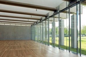
The two halls on the south side of the pavilion have very different appearances and uses. One is enveloped in glass on two sides and above, letting in an abundance of sunlight. The other gallery, which houses the Asian collection and has no overhead lighting, is ideal for light-sensitive works.
Fresh air circulates within the galleries, but the venting source is inside the floor, hidden from view. This “breathing floor,” Lee said, is a whole new type of ventilation system and one unique to the pavilion.
The concert hall –– seating 298 and outfitted with a 9-foot grand piano, stage lighting, and custom acoustic paneling –– is already booked into late next year by the Chamber Music Society of Fort Worth, Van Cliburn Foundation, and Fort Worth Opera, among others.
Along with a badly needed underground parking garage, the remaining square footage will be utilized by the classrooms, administrative spaces, and the library, which will be open only to scholars and the Kimbell’s curators, staff members, and docents.
********
Not everyone is thrilled with the new pavilion, of course. In Bloomberg Businessweek, architecture critic James Russell complimented many facets of the new museum but not the overall project. He described “the way every surface, bolt, and tie rod has been refined and proportioned with supreme –– if soulless — confidence.”
Inga Saffron, architecture critic for The Philadelphia Inquirer, said the outside was “dull” while the interior demonstrated that Piano had “run out of ideas.”
Dallas architect Michael Malone said it’s “not cutting edge, and the exterior is kind of bland” but praised the interior as spectacular.
But Malone understands the key to museum architecture. Piano deliberately made the pavilion “reticent and quiet,” he said. “A lot of critics have caught onto the idea that every building needs to be a critical departure from the past, but the Kimbell was not the right place for that.”
Mike Barnes, director of the Fort Worth firm Barnes & Associates Architects and an affiliate of Historic Camp Bowie, agreed. “Art museums are made to be backdrops to the art,” he said. “The art needs to be first and foremost. [Piano] has done a good job of keeping it low-key, so it harmonizes with the Kahn building.”
A good architect, he added, will take into account nearly every single requirement. “Having the Kimbell next to [the pavilion] created new rules,” Barnes said.
Achieving the right architectural balance in this case, Klahr said, is next to impossible but still must be sought after. “The equation regarding museum design is complex,” he said. “It should be, but this has often produced buildings that serve municipalities well in terms of the casual tourist but not in terms of dedicated museum-goers. Because of this, results run the gamut, from building-as-star to building-as-self-effacing-entity. The pavilion falls somewhere in the middle of this spectrum, which I think is healthy.”
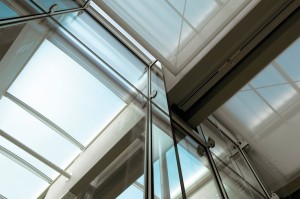
The pavilion resembles a few of Piano’s other projects, including The Modern Wing of the Art Institute of Chicago. Opened in 2009, the Chicago wing, much larger than the project here, also incorporates a lot of concrete and glass and, like the pavilion, makes use of a roof system in which sunlight can be managed via computer-controlled blades over a glass roof, with aluminum louvers directing the rays.
“There are similarities [among] all his museums,” Malone said. “They all have linear plans with [extensive use of] glass that expresses his effort to deal with natural light. It’s a language he’s comfortable with.”
At a recent opening ceremony for the pavilion, Piano thanked the countless people involved in making his project a reality.
“Art makes people better,” he said. “Art buildings make cities better. Art changes the world one person at a time.”
In his closing remarks, he summed up the role of museum architecture as providing functional shelter to art and adding to the narrative of great art.
“Every piece of art tells a story,” he said. “The pavilion is another story, another incredible story.”




Write more, thats all I have to say. Literally, it seems as
though you relied on the video to make your point.
You obviously know what youre talking about, why throw away your intelligence on just
posting videos to your weblog when you could be giving us
something enlightening to read?
Ugly building with an even uglier statue outside. Boobs in the back? Give me a break.